Component Plot
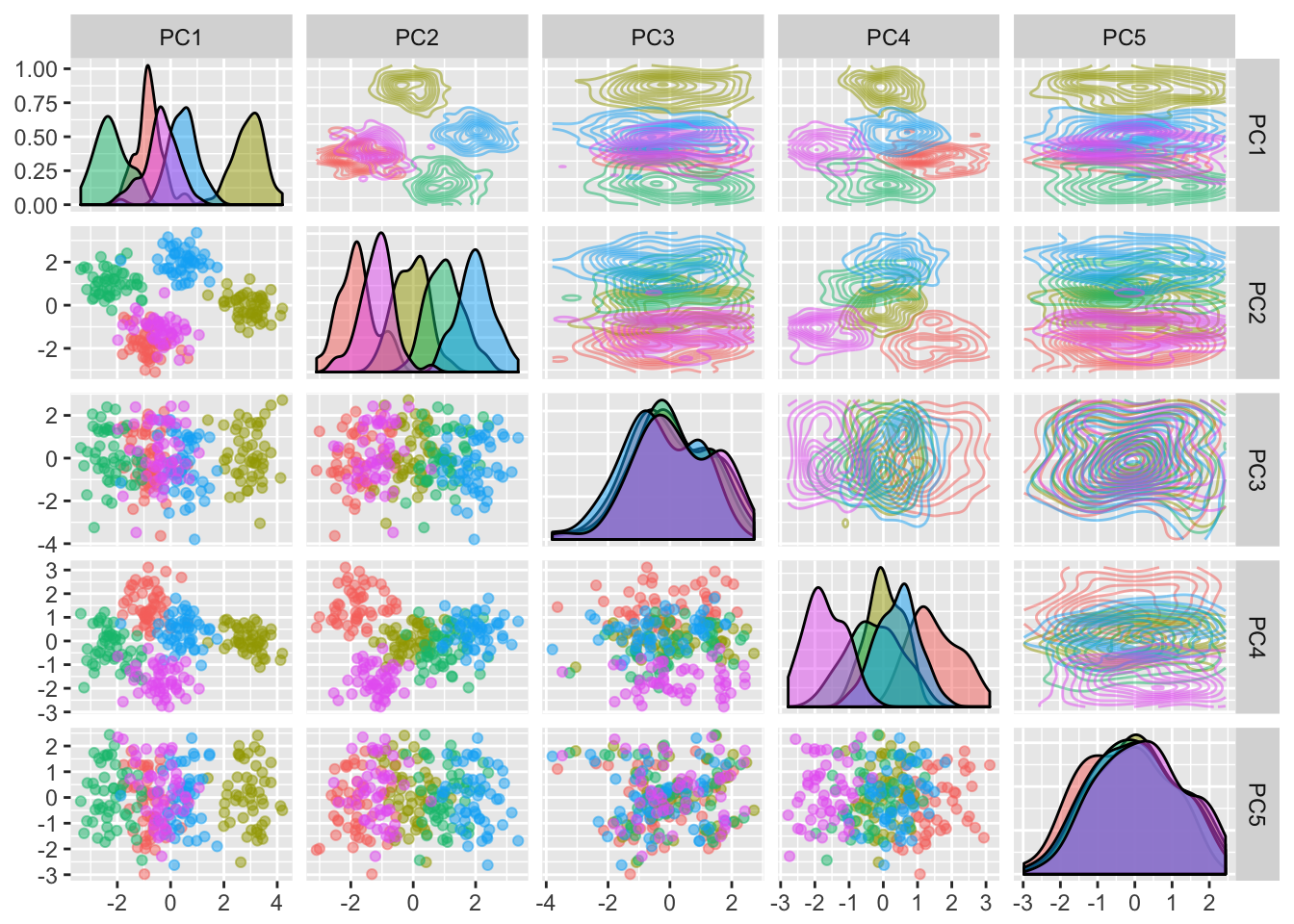
The components of the PCA dimensionality reduction will be displayed in a pairs plot. Each of the components are plottet against each other.
- The lower diagonal shows the data points projected to the respective two dimensional component space.
- The upper diagonal shows a contour plot of the data projected the respective two dimensional component space.
- The diagonal shows a density plot of the projection of variables to a principal component axis.
Load data
library(BioViz)
library(reshape2)
library(ggplot2)
data(fiveClass)
Y <- fiveClass$Class
X <- fiveClass[, 2:ncol(fiveClass)]
Default Pairs Plot of the First 3 Principal Components
dimred.plot_pca(X)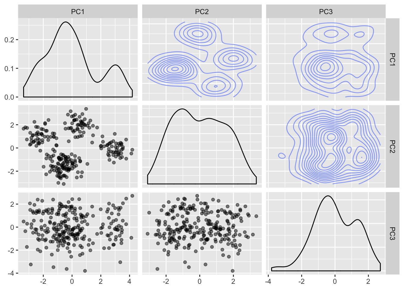
Pairs Plot of the First 3 Principal Components Labeled by Class Vector
dimred.plot_pca(X, Y)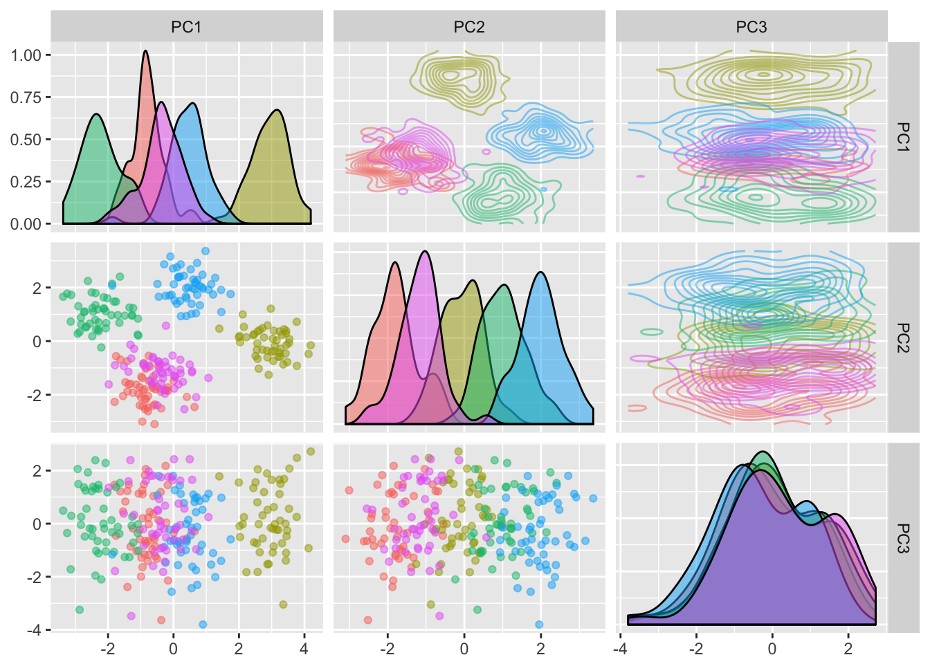
Varying the Number of Components
dimred.plot_pca(X, Y, ncomp=5)